Campaign case study
Test campaign for Canada’s leading and largest cycling brand
Overview
My role: Creative director
Industry: Cycling/Mountain biking
Duration: 2 days
THE CLIENT
Norco is Canada’s largest and oldest bicycle design and manufacturing company. A global powerhouse, Norco specialises in mountain bikes, and is known for its innovation and rider-specific focus. This project was a proposed campaign for their 2026 marketing push.
MY ROLES + RESPONSIBILITIES
- Creative director
- Graphic designer
- Copywriter
- Photo shoot coordinator
OUTPUTS
- 1 cohesive campaign hero concept which includes:
- 1 home page hero image and tagline
- 1 one social post
- 1 digital banner
- 1 point-of-sale item
TOOLS I USED
- Adobe Photoshop
- Adobe Illustrator
- Glitché app
Phase 1: discovery
RESEARCH AND CONTEXT
Norco was looking to explore new campaign directions, and sent me a brief that centered around the concept of ‘The Moment that Made You a Rider,’ or, as they described it: ‘There’s that one ride that changes everything…when fear turns to flow, when you stop thinking about what’s next and start feeling it. That moment is why we ride.’ Norco was looking for a sample campaign that:
- Embodied emotional storytelling that felt real, not staged
- Communicated a clear visual tone that could live across channels
- Demonstrated bold thinking that still feels true to the ride
- Included more varieties of riders
In my initial research, I looked at as many of Norco’s touchpoints as possible—digital (including social), in-store, and press. I also looked at Norco products the sold in person—bikes, press, merch and promo items. I then went on to look at direct competitors in the bike industry, and indirect competitors in the outdoor equipment + apparel industries. Bike companies I researched included Specialized, Giant, Fox Racing, Evil Bikes, Santa Cruz, Canyon, Rocky Mountain and Wzrd. Outdoor apparel companies I researched in included Arc’teryx, MEC, Innov8, Fjällräven, 7mesh and Lululemon…and more.
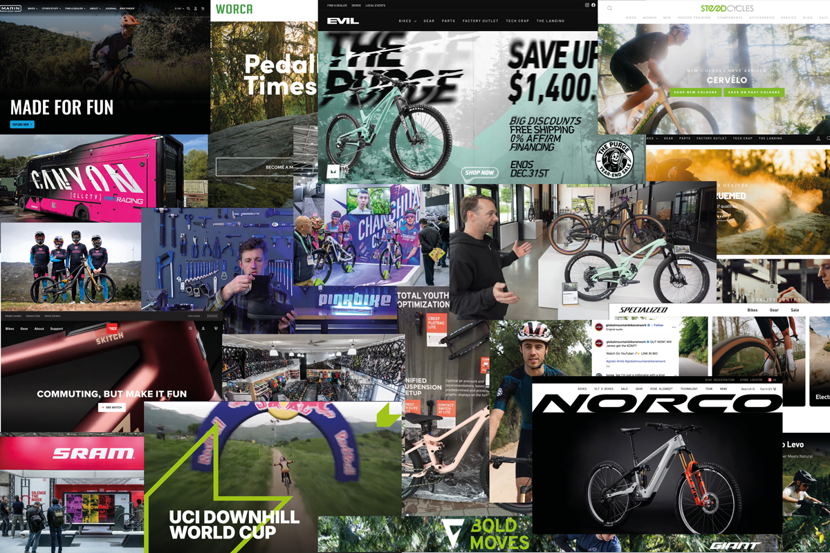
Above: Examples of current bike industry branding and design.
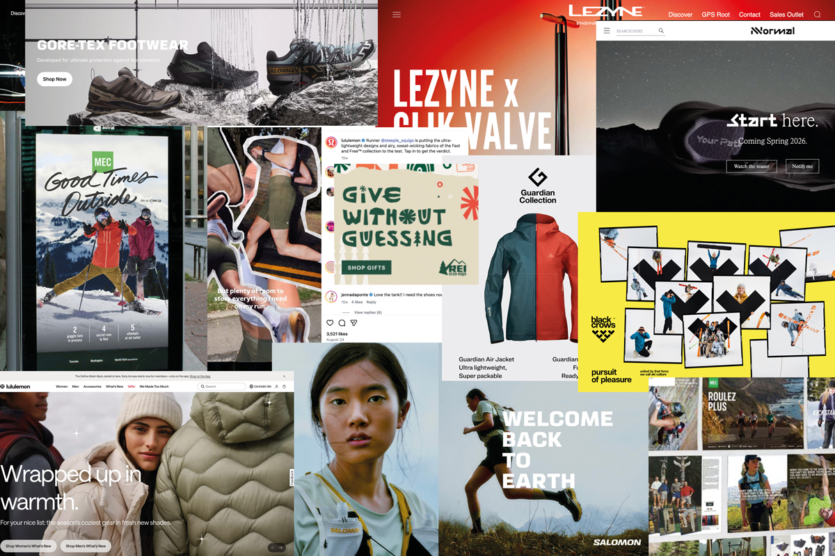
Above: Examples of outdoor industry branding and design.
Phase 2: research + define
As my research deepened in Phase 2, I noticed that many bike brands—with few exceptions—had relatively similar-looking campaigns. Most were (unsurprisingly) bike-focused, and typically featured white male riders. I noticed the the typography used on major bike brand websites was often a neutral sans-serif (often using all caps), with very few straying from this.
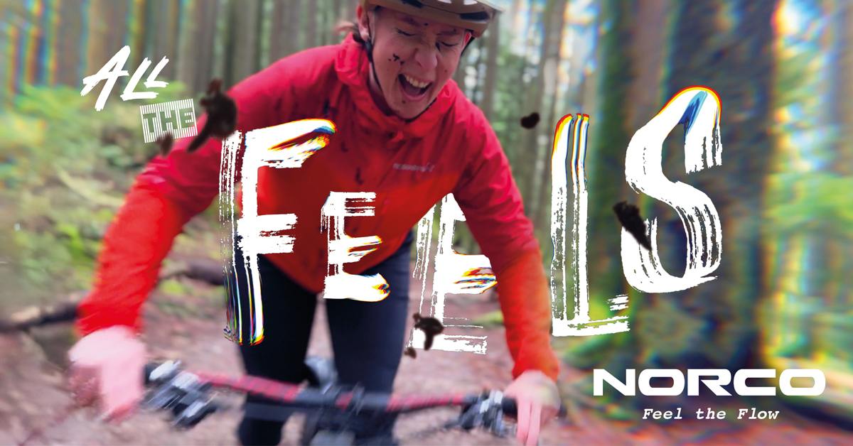
Above: Proposed Google responsive banner ad sent to Norco. I couldn’t find an existing photo that conveyed what I was looking for, so I coordinated a photo shoot for this image. My aim was to use a photo of a non-pro rider to express the thrill and feeling of mountain biking— for the typical rider (Norco’s core clients). To add to the tactility of the ad, I had mud thrown at the model and added some mud to the ‘lens’ in Photoshop to create more dimension. This, coupled with the model’s expression, was designed to connect with the viewer emotionally.

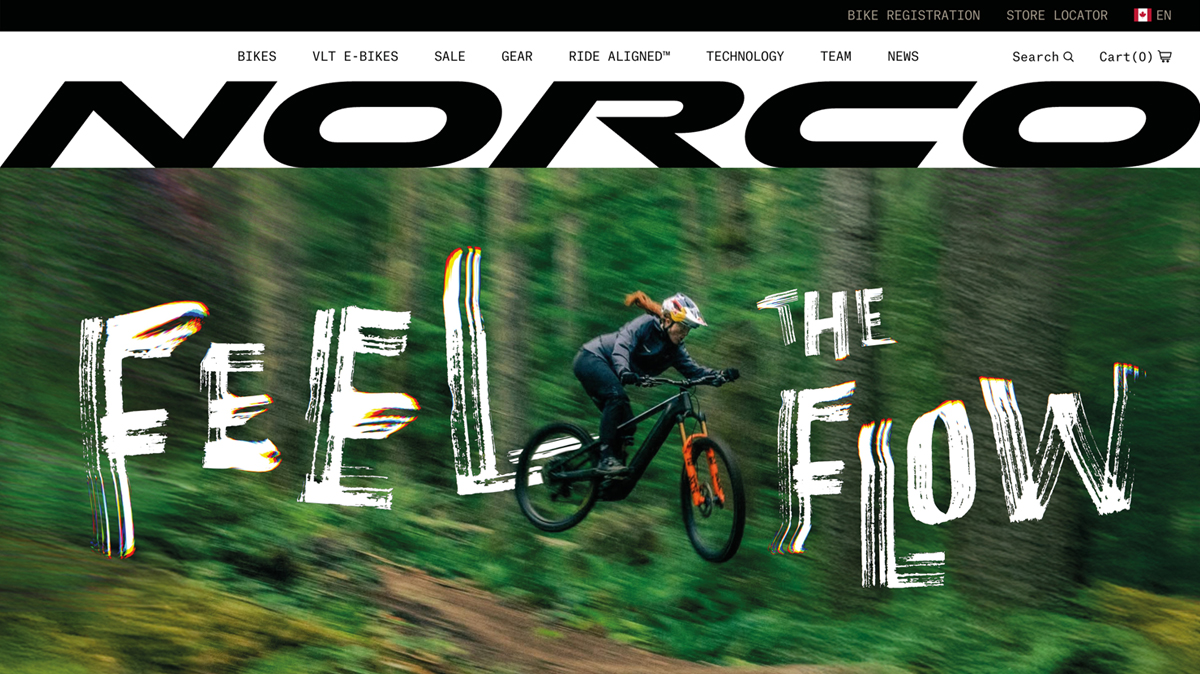
Above: Proposed homepage hero image and tagline sent to Norco. I chose to use this photo because its of Norco professional rider Gracie Hemstreet. Not only was the photo dynamic and instantly brought me into the moment, Gracie had made recent headlines winning numerous World Cup Downhill races. In my design, I cut Gracie out so that she could dynamically mingle with the tagline I used. I also loved her ponytail— something that could instantly identify her as a female athlete and potentially draw in a more diverse demographic. I chose to use Marker Aid typeface because of its rawness and it alluding to tire tracks. To push the type even more, I added custom flourishes and wiggles to further convey the grittiness and tactility of riding. Rainbow skewing from the letters allude to surges of adrenaline a mountain biker feels riding down challenging terrain. Finally, I crafted the ‘Feel the Flow’ copy to align with the brief’s main objective: ‘capture the emotion of riding.’ Photo source: Norco.
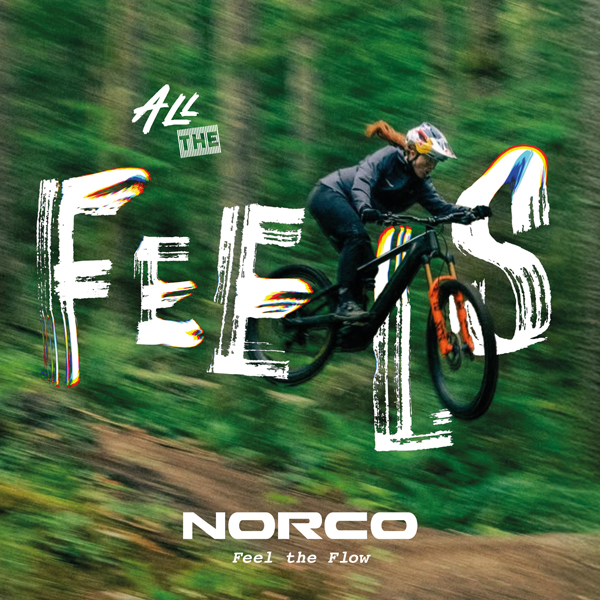
Above: Proposed Google responsive banner ad sent to Norco, a variation of the home page concept with a slightly different tagline.
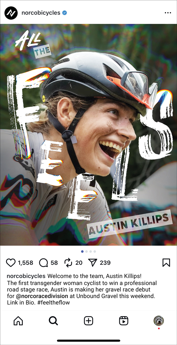
Above: Instagram post, featuring professional rider Austin Killips (source: Outside Magazine). Austin is a trans-identifying athlete who is currently not a Norco athlete, but in my copywriting I imagine that she is a sponsored Norco gravel racing athlete. Representation matters, and I feel that this also aligns with Norco’s values. I crafted the ‘All of the Feels’ headline to align with the theme of the brief.
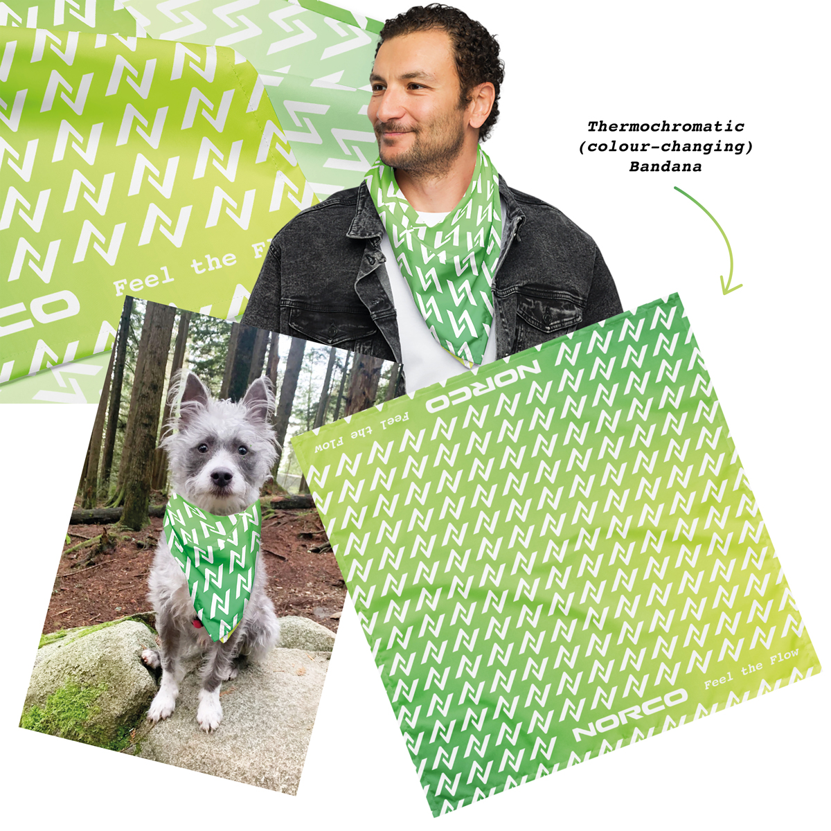
Above: Thermochromatic (aka colour-changing via body heat) bandana with repeating Norco icon and ‘Feel the Flow’ tagline. This temperature-changing bandana shifts from a darker green to a lighter green when warmed by body temperature. I created this unisex bandana to align with the emotion and tactility of the campaign, and for a fun brand awareness item could be given away at brand activation events (and to sell online). The bandana’s pattern aligns with Norco’s Race Division branding.
Phase 3: design + ideation
- I brainstormed and created 10 + taglines for the campaign.
- I searched over 150 images that could be relevant to the brief.
- I edited the photos down to ones I felt could work in the campaign. In this process, I realised that I’d need to do a photo shoot to create a photo that worked for the concept I had in mind.
- I experimented with 10+ different typefaces and choose one that best suited the campaign.
- I manipulated the final typeface in Photoshop and the Glitché app.
- I coordinated and executed a photo shoot
Phase 4: delivery and implementation
- Liased with Norco to confirm final ad sizing.
- Sent final artwork to the Norco head office.
Results
- 1 engaging and emotive campaign concept
- 1 home page campaign concept and tagline
- 2 Google responsive ads and taglines
- 1 branded bandana
- 1 one social post
FUTURE CONSIDERATIONS
I would have loved to have portrayed more of an array of models, but I was limited by time, and the photos I had permission to use. For the Google Responsive Banner, I would have much preferred to cast a non-caucasian model, but ended using myself as the shoot was so last-minute. This is something I’d change in future.
WHAT WAS LEARNED?
I learned how fun it can be to work with typography in a much more fluid way—incorporating distortions into the copy really helped hone in on the emotion in the designs. I also discovered a fun (re)use for termochromatic fabric (remember Hypercolor clothing from the 90s? That was an example of thermochromatic fabric). I remember when Hypercolor was first used in fashion it was fun, but it once wearers discovered that it highlighted people’s warm armpits and crotches, it lost its appeal. Using it in bandana form would be a playful and very wearable way to bring the retro fabric back to life.


