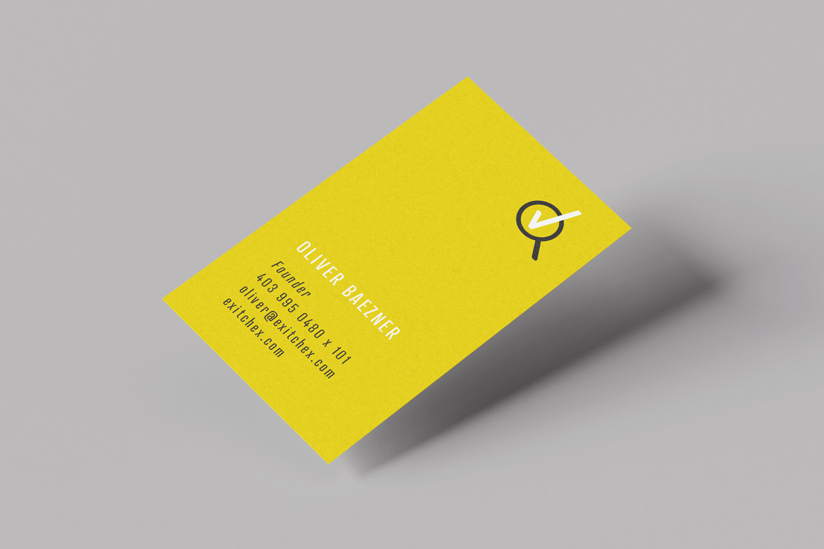
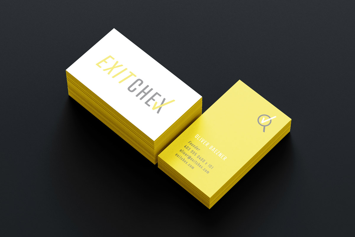
Wordmark + business card
Designs for a company that independently evaluates employee satisfaction
Overview
My role: Art Director and Designer
Industry: Business management
Duration: 1 week
THE CLIENT
Exit Chex is an unbiased third party that conducts confidential interviews with employees to help companies better understand their work culture and environment. Whether it’s an exit interview, or an interview with current employees, information Exit Chex gathers is typically more candid than that obtained by internal HR interviews—and can offer poignant insights into a company’s employee satisfaction (or lack thereof).
MY ROLES + RESPONSIBILITIES
- Art Director
- Designer
OUTPUTS
- 1 logo with 2 variations
- 1 icon with 3 variations
- 1 business card
TOOLS I USED
- Adobe Illustrator
- Adobe Photoshop
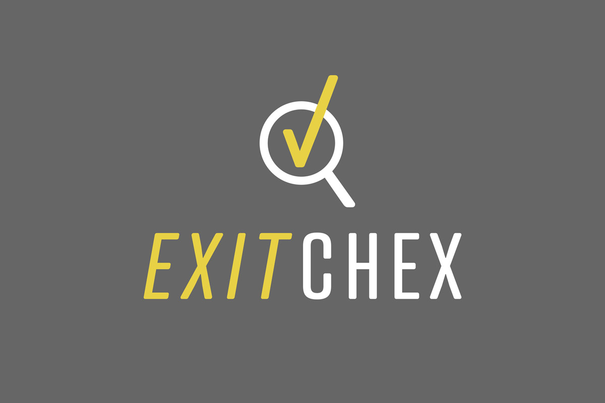
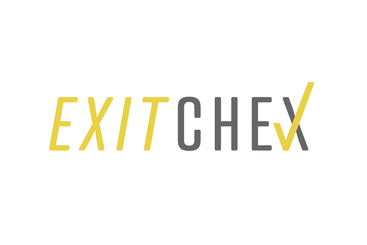
Above: Final versions of the Exit Chex logo
Phase 1: discovery
The client needed a wordmark/logo and business cards for their newly-launched company that exuded trust, expertise, and approachability. They also wanted branding that communicated ‘investigation’ and ‘success.’ Colour was particularly important to the client—they felt strongly about using yellow—a colour that (in their view) was authoritative, yet approachable.
INITIAL RESEARCH
I first collected an array of security-focused logos, and then independent HR company logos. There were a mixed bag of treatments—from minimal to super colourful logos. Puzzle pieces and shields tended to be referenced in imagery in both industries.

Above: Examples of logos and imagery used in the security and HR industries
Phase 2: research + define
- I researched typefaces used in the security and independent HR industries
- I downloaded 12+ typefaces and began testing them to see if they fit the design brief
- I researched colourways to see which combinations supported the concept, and which didn’t. I incorporated yellow in many of my explorations because it was key to the design brief.
- I explored the concepts of ‘seeking’ and ‘identifying’ in the logo, and this is where the eye and magnifying glass iconography came into play
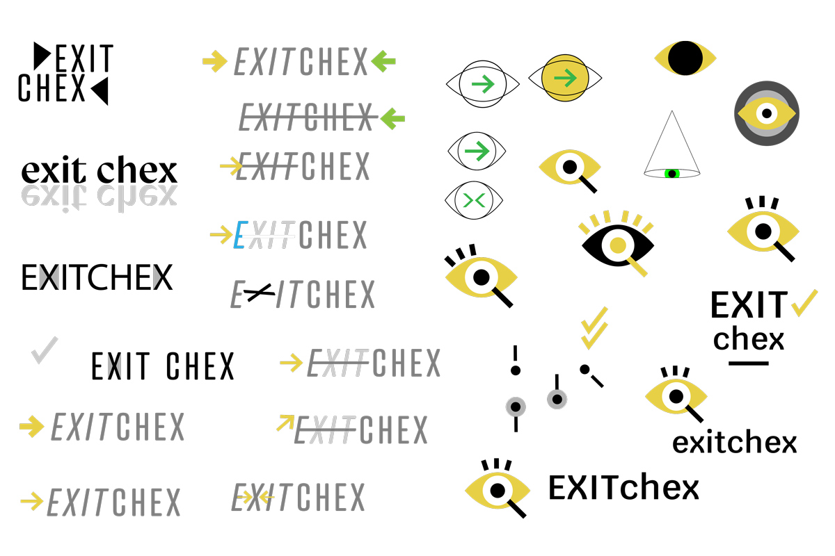
Above: Excerpts from my ideation process
Phase 3: design + ideation
- I created 10+ variations of the logo and narrowed down possible typefaces to 3
- I designed 5+ icons that could be used together or separately with Exit Chex’ wordmark
- I used scale, kerning, leading and tracking to refine the wordmark’s typography
- I tested the logo’s legibility at various sizes and in different contexts
- I chose Atrament typeface for the final logo. I found its geometric structure and rounded edges struck a nice balance between ‘authoritativeness’ and ‘approachability.’
- I edited the wordmark’s accompanying magnifying glass/checkmark icon so it blended with Atrament’s type style
- I created 3+ versions of an Exit Chex business card with the finalised logo
Phase 4: delivery and implementation
- I made final adjustments to the wordmark and icon
- I converted the logo into print and digital formats
- I transposed the business card into a printable version, and sent it to print
Results
- 1 logo with 2 variations
- 1 icon with 3 variations that can be used with or without the logo’s wordmark
- 1 set of business cards
FUTURE CONSIDERATIONS
If I’d had more time, I would have loved to explore die cutting options for the business card. I would have also loved to create stickers with the magnifying glass icon.
WHAT WAS LEARNED?
I learned that choosing the right shade of grey can really make or break how yellow communicates in a design. Grey can either cheapen or add value to a design’s look (when paired with yellow)—it all depends on the colours the grey contains.

