BRAND IDENTITY
For a zero emissions consultancy
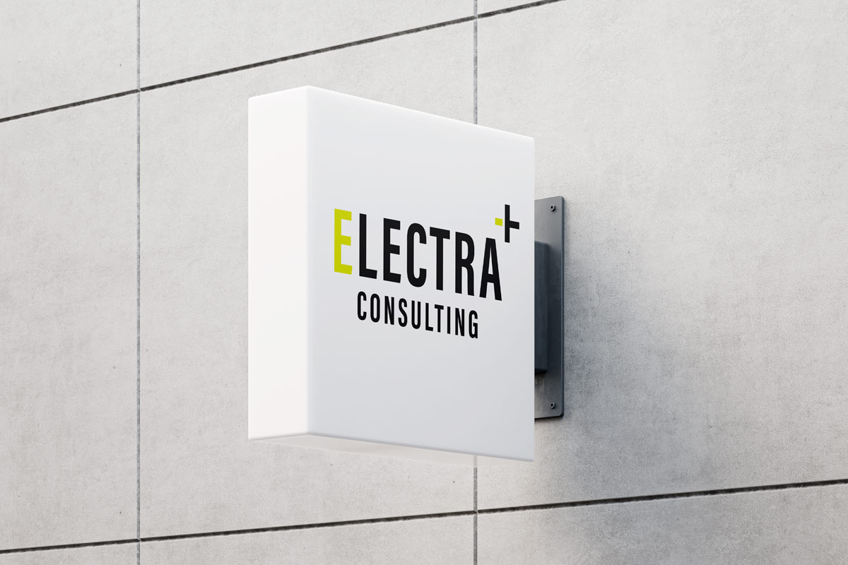
Above: Electra consulting logo sign mockup
Overview
My roles: Art Director and Designer
Industry: Zero Emissions
Duration: 2 weeks
THE CLIENT
Electra Consulting is a company that works with private organisations, local and provincial governments to create campaigns and events that support the adoption of zero-emission technologies. They are based in Vancouver, Canada.
MY ROLES + RESPONSIBILITIES
- Art Director
- Designer
OUTPUTS
- 1 logo with 3 variations
- 1 icon
- 1 Brand guidelines book
TOOLS I USED
- Adobe Illustrator
- Adobe Photoshop
- Adobe InDesign
Above: Final versions of the logo
Phase 1: discovery
The client needed a brand identity for their newly-launched zero emissions consulting company. One of the key things the they wanted to avoid with their brand was stereotypical electric car imagery or colours (battery icons, lightning bolt symbols, blue colourways, etc.). They wanted the brand to communicate a mixture of professionalism and approachability.
INITIAL RESEARCH
I first collected an array of current zero emissions iconography and identities. Just like the client mentioned, many used battery icons, lightning bolt symbols and the colour blue.
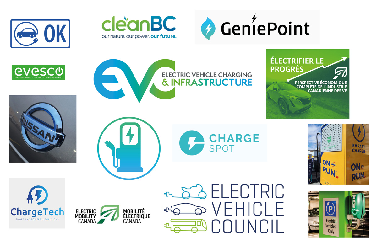
Above: Examples of existing logos used in the zero emissions industry
Phase 2: research + define
After learning more about branding used in the zero emissions industry, it was time look into typography.
- I researched typefaces used in the zero emissions industry
- I downloaded 15+ typefaces and began testing them to see if they fit the design brief
- I researched colourways to see which combinations supported the concept, and which didn’t. I often start with colours that don’t suit a project during my process. Why? It makes me question why they don’t work, and in the process, I often find even better colourway solutions.
- I explored the concept of battery polarity and its visualisations, and eventually distilled my ideations down to a word mark and a hybrid ‘+/-’ symbol
Acumin typeface worked well because of its modern-sans serif look, and its ability to retain a sense of personality and humanity.
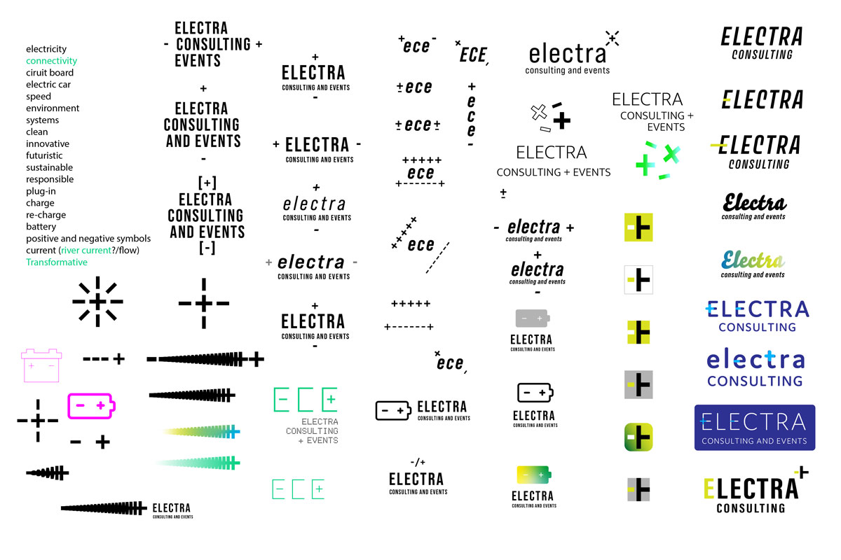
Above: Excerpt from my ideation process
Phase 3: design + ideation
- I created 8 variations of the logo and narrowed down possible typefaces to 2
- I used scale, kerning, leading and tracking to refine the logo’s typography
- I tested the logo’s legibility at various sizes and in different contexts
- I chose with Acumin typeface for the final logo: it’s a modern-looking sans serif, but it still manages to retain some personality and humanity with its slightly angled letterforms
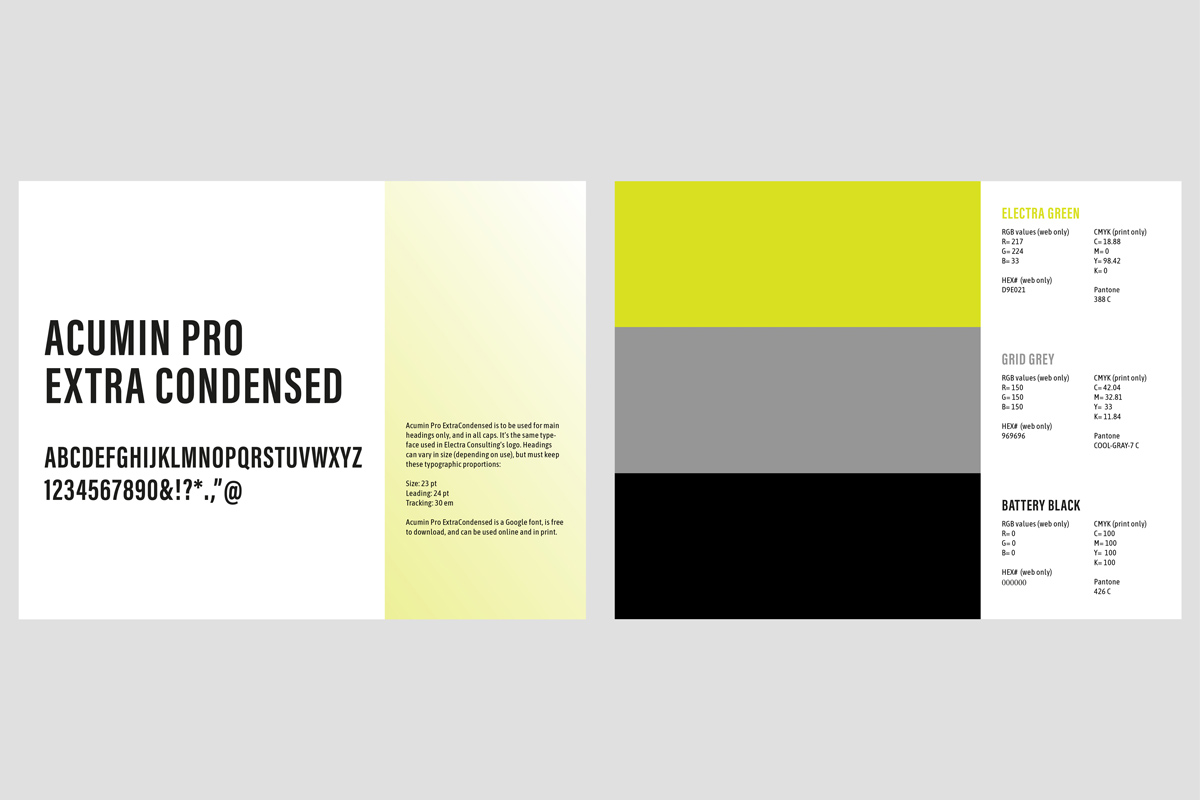
Above: Excerpt from Electra Consulting’s brand guide
Phase 4: delivery and implementation
- I made final adjustments to the logo
- I converted the logo into print and digital formats
- I created the brand guidelines booklet

Above: Electra Consulting icon used on signage
Results
- 1 logo with 3 variations
- An icon that can be used with or without the logotype
- A comprehensive brand guidelines booklet (digital and print formats)
FUTURE CONSIDERATIONS
If the project scope were bigger, I would have loved to create an animated version of the plus icon in the logo.
WHAT WAS LEARNED?
I learned that there is a lot of opportunity for unique typography use in the zero emissions space, and that colourways used in the industry are becoming more and more adventurous.

