LOGO DESIGN
For a public library organisation
Overview
My role: Art Director and Designer
Collaborator on Art Direction: Elevate Design
Industry: Information and Cultural Industries
Duration: 3 weeks
THE CLIENT
Marigold Library System is a not-for-profit collaborative of 42 member municipalities in Southern Alberta, Canada, established with the vision of providing cost-effective, quality library service to both urban and rural residents through the sharing of collection material, resources and expertise.
MY ROLES + RESPONSIBILITIES
• Art Director
• Designer
OUTPUTS
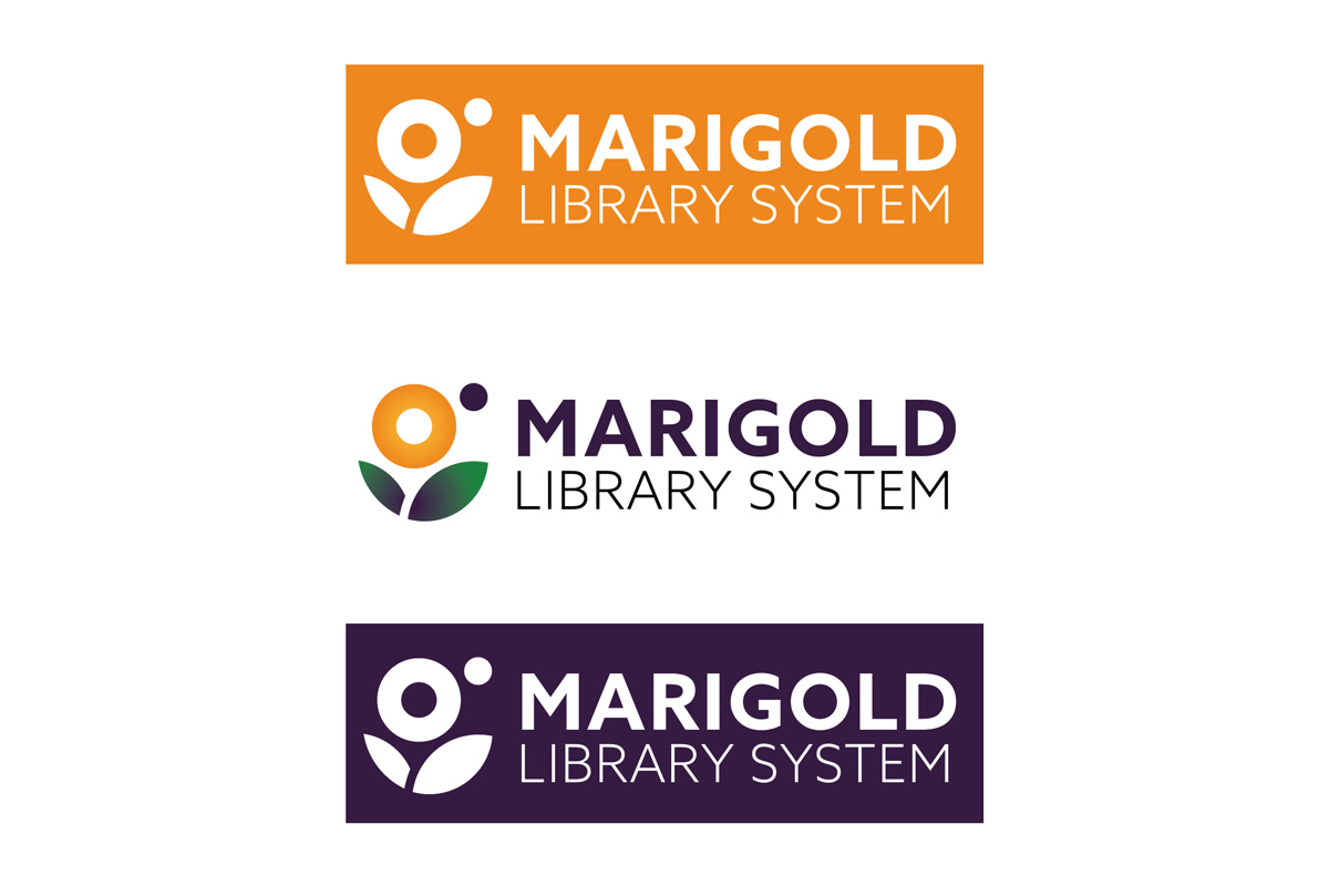
• 1 logo with 3 variations
TOOLS I USED
• Adobe Illustrator
• Adobe Photoshop
Conveying optimism and approachability in the logo were key in my design process. I used round, friendly shapes and saturated colours to make these feelings tangible.

Above: Logo in use on the Marigold website, on a mug, and in printed documents
Phase 1: discovery
CONTEXT AND INITIAL RESEARCH
Marigold Library System (MLS) was looking to expand and further modernise their services, as well as prepare for a move to a newly-constructed head office. In support of this growth, Marigold wanted to refresh their brand. Key qualities the client wanted to reflect in their new look were: openness, energy, trust, and strong brand recognition. The name ‘Marigold Library System’ was inspired by the marigold flower, considered to be bright, lively, and resilient, so this also needed to be reflected in the new design as well.
I researched not only Marigold Library System and its history, but other library and library systems worldwide. I found that many library-related designs were quite literal in their portrayal of books, etc. Because the Marigold flower and its colour were so central in the organisation’s history—and that MLS is a service, not a library itself—I focused on this symbol, and the growth the company was experiencing.
Above: MLS logo use on a branded pen

Above: Excerpt from my logo ideation process
Phase 2: research + define
- I experimented with round, friendly shapes and saturated colours to push the logo’s approachability and optimistic feel
- I incorporated asymmetry into my logo ideations to help communicate a sense of growth and resilience
- I created 9 variations of the logo, and edited my ideations down to focus on the marigold flower itself (versus just using a wordmark)
Above: Logo in use on promotional canvas tote bags
Phase 3: design + ideation
- I experimented with 12 different typefaces, and narrowed them down to three strong options
- I chose Azo Sans as the typeface for the logo’s wordmark: a rounder and more humanist typeface, Azo paired well with the approachability of the flower logo. Azo worked well, as it retained an aspect of geometry and structure, despite its softer feel. Tracking it open also helped reflect MLS’s approachability and was easily read at smaller sizes.
- I made 2 alternate versions of the logo in single colours for use in a variety of contexts
Phase 4: delivery and implementation
- I made final adjustments to the logo and wordmark (spacing and kerning)
- I converted the logo into print and digital formats
Results
• 1 logo with 3 variations and an icon that can be used with or without the logotype
FUTURE CONSIDERATIONS
If I’d had more time, I would have created an animated version of the marigold flower blooming.
WHAT WAS LEARNED?
I learned that one’s initial ideas in the design process can often be the strongest. Ideating is still very important, as it can often serve to validate those earlier ideas.


