Logo rebrand
Rebrand for a trail maintenance organisation

Overview
My role: Art Director and Designer
Industry: Cycling/Mountain biking
Duration: 2 weeks
THE CLIENT
The North Shore Mountain Bike Association is a non-profit organisation dedicated to maintaining mountain trails on Vancouver, BC, Canada’s North Shore. The Shore Corps is a group of volunteer trail builders who have graduated from the NSMBA’s trail maintenance training academy.
Race Face is a global mountain bike brand—based in BC—that makes bike components, protective clothing, and outerwear. RF is an NSMBA partner and sponsors the Shore Corps program.
MY ROLES + RESPONSIBILITIES
- Designer
- Concept developer
- Graphic designer
OUTPUTS
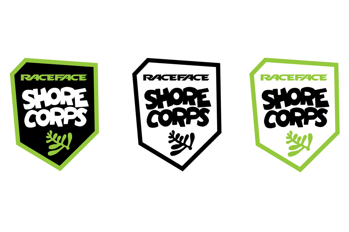
- 1 logo (with three variations) used on tshirts, on the NSMBA website, and in social media
TOOLS I USED
- Adobe Illustrator
- Adobe Photoshop
Phase 1: discovery
RESEARCH AND CONTEXT
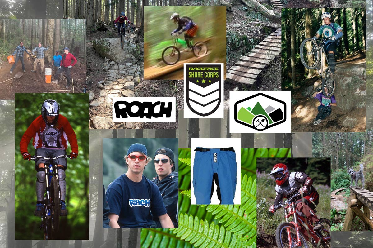
In my research, I learned that the previous Shore Corps logo (see crest on mood board above) was being interpreted by members of the public as having too much of a military feel. The NSMBA was growing, and wanted to promote inclusivity and highlight the organisation’s work on environmental sustainability. Around the same time, a member of the North Shore community was charged with serious trail vandalism—vandalism that was proven to have the intent to seriously harm riders on a popular mountain bike trail—a high-profile case that received lots of press coverage.
In this tension-filled context, the old logo Shore Corps could was seen as fostering the polarisation of mountain bikers versus other trail users, and this was not good: a new Shore Corps logo design was needed.
Another challenge that faced the NSMBA was that many members had grown fond of the original Shore Corps badge design, and didn’t see a need for a new logo.

Above: mood board for updated Shore Corps logo. Pictured above: Retro Roach mountain bike gear and riders, Roach logo [middle left], original Race Face Shore Corps logo/badge [middle], NSMBA logo [middle right] and current trails and riders on the North Shore.
Phase 2: research + define
As my research deepened in Phase 2, I was reminded of 90s mountain bike brand, Roach. Roach was an iconic Vancouver mountain bike clothing and protective wear brand founded in the 1990s. I discovered that The Roach logo is still highly identifiable in the mountain bike community, and that—sadly—Roach’s founder/designer Ingrid Doerr had passed away in 2019.
Phase 3: design + ideation
- I received permission from Ingrid’s (Roach’s founder) family to proceed with the Roach logo-inspired design.
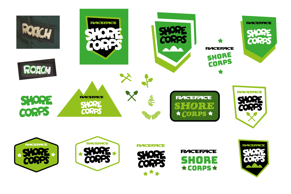
- I created 10+ ideations of the Shore Corps logo that referenced Roach’s logo. During this process I learned that Race Face—the sponsor of the new Shore Corps logo—acquired Roach in 2002, so there was a direct link between Roach and Raceface. This helped inform my process. My aim was not only to pay homage to Roach and involve Race Face in the design, but to draw from and connect with the deep mountain bike heritage and nostalgia on the North Shore.
- I referenced the badge shape of the previous Shore Corps logo in my ideations with the intent to encourage acceptance of the new version of the logo.
- I incorporated a fern into ideations of the logo to drive home the fact that the Shore Corps cares for the forests they work in.
- I adjusted the external internal spacing of the Shore Corps logo letters to ensure legibility at smaller sizes.

Above: Excerpt from the logo ideation process
Phase 4: delivery and implementation
- Liased with Race Face on the logo placement and tshirt colours.
- Created three versions of the Shore Corps logo for different uses: a black and white version, and two different colour versions for use on different backgrounds.
- Sent final artwork to the North Shore Mountain Bike Association and to Race Face.

Results
- 1 digital and print-ready logo with three different variations
- A refreshed and more approachable logo that attracted more Shore Corps volunteers
FUTURE CONSIDERATIONS
I’d have loved to expand the logo’s use into more merch for the NSMBA, but time was limited.
WHAT WAS LEARNED?
I learned how important it can be to transpose some familiarity of a previous design into a new version of a design, especially with such a passionate community is involved (in this case, the mountain bike community).
Above: Shore Corps tshirt on NSMBA’s Instagram


